Midnight was my favorite edition released last season. This one is just for me - simple geometric patterns (with lots of diagonal stripe!) in white, black, soft grey and yellow colors.
I just fell in love with all the journaling cards it had and wanted to put them to use right away! I decided to make a page using some of them. The plan was to make a very light page with lots of journaling cards in almost black and white colors... Here's a look at the process...
I started with these pieces pulled from the kit:
White cardstock matted on dark grey, added a blue map print...
Arranged selected cards, cutting the diagonal stripe one so it will stretch across the page...
Added a photo, matted on white cardstock:
I found a tag I kept and decided to use it here. Added a tab to one of the cards that I actually wanted to use for journaling.
From one of the Echo Park papers, I've cut these circle elements:
And Silhouette shape that was cut out of white cardstock:
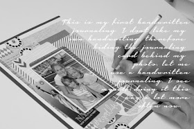
I love creating scrapbook pages, but my least favorite step is typing my journaling. I don't like how handwritten journaling looks on a page, but hiding it actually saved me some time :)
Added last few little things, like brads and washi tape, and here is my completed page:
It didn't turn out how I pictured it, but I sure did have some fun! I just wanted to play! It was one of the quickest pages I made because I tried not to overthink about all the little details.
Thanks for coming over and I hope you can find some time to play too :)
Have a great day and I will see you soon!


First of all… LOVE the banner!!!!The soft colors are just lovely!!! But I must make a comment on the rest… the really really soft gray (the comment like) is so hard to see :-D sorry! You should make it a little darker :-D
ОтветитьУдалитьNow the LO… LOVE IT!!! You know how much I loved the “globe” one that you did! This one’s just a awesome :) I love the picture of you writing with the writing on it… you should use that for your LO’s :) anyway, you make scrapbooking sound so easy, it “almost” make me want to do it ;) haha but I can see why you loved your gift so much… enjoy!!! You are great at it!!!
Very nice banner for a change, until fall pictures I guess :)
ОтветитьУдалитьI love how you took pictures of all the steps, it really helps if I was doing similar LO. Have to agree with Ira globe really adds something special to this page.
One thing is that this LO is not really for those who on the buget. That is A LOT of journaling cards to use on one page. Even though page turned out absolutely beautiful, but I would've had really hard time with it.
Thank you girls! I love those in depth discussions! Btw, those journaling cards are from Project Life kit, and the kit contains 616 cards. That is A LOT OF CARDS! Why not using them on a page? I'm sure I'll use more of them on regular scrapbook pages:)
ОтветитьУдалитьIra, thanks, I'll try to adjust the grey colors:) I appreciate honest opinions! :)
Does the banner look out of focus to you too? I must have changes it a thousand times and it still doesn't look right :(
What a beautiful page ! I love it !
ОтветитьУдалитьThank you Laure!
ОтветитьУдалить